ember-sortable
Ember-sortable


Sortable UI primitives for Ember.
Migration
If you are migrating from 1.x.x to 2.x.x. Please read this migration guide.
Requirements
In version 2.0.0+, our closest polyfill seems to break some app’s production build. To mitigate this, the closest polyfill will only enabled if it doesn’t break the production build (if the polyfill file is recognized by the build). Affected apps will need to supply their own closest polyfill to ensure compatibility with IE. This issue is tracked here.
Version 1.0 depends upon the availability of 2D CSS transforms. Check the matrix on caniuse.com to see if your target browsers are compatible.
Installation
$ ember install ember-sortable
Usage
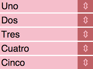
<span class="handle">↕</span>
The onChange action is called with two arguments:
- Your item models in their new order
- The model you just dragged
// app/routes/my-route.js

export default Ember.Route.extend({
  actions: {
    reorderItems(itemModels, draggedModel) {
      this.set('currentModel.items', itemModels);
      this.set('currentModel.justDragged', draggedModel);
    }
  }
});
Declaring a “group model”
When groupModel is set on the sortable-group, the onChange action is called
with that group model as the first argument:
<span class="handle">↕</span>
// app/routes/my-route.js

export default Ember.Route.extend({
  actions: {
    reorderItems(groupModel, itemModels, draggedModel) {
      groupModel.set('items', itemModels);
    }
  }
});
Changing sort direction
To change sort direction, define direction on sortable-group (default is y):
Changing spacing between currently dragged element and the rest of the group
When user starts to drag element, other elements jump back. Works both for the x and y direction option.
In y case: elements above current one jump up, and elements below current one - jump down.
In x case: elements before current one jump to the left, and elements after current one - jump to the right.
To change this property, define spacing on sortable-item (default is 0):
Changing the drag tolerance
distance attribute changes the tolerance, in pixels, for when sorting should start.
If specified, sorting will not start until after mouse is dragged beyond distance.
Can be used to allow for clicks on elements within a handle.
CSS, Animation
Sortable items can be in one of three states: default, dragging, dropping. The classes look like this:
<!-- Default -->
<li class="sortable-item">...</li>
<!-- Dragging -->
<li class="sortable-item is-dragging">...</li>
<!-- Dropping -->
<li class="sortable-item is-dropping">...</li>
In our example app.css we apply a
transition of .125s in the default case:
.sortable-item {
  transition: all .125s;
}
While an item is dragging we want it to move pixel-for-pixel with the user’s mouse so we bring the transition duration to 0. We also give it a highlight color and bring it to the top of the stack:
.sortable-item.is-dragging {
  transition-duration: 0s;
  background: red;
  z-index: 10;
}
While dropping, the is-dragging class is removed and the item returns to its default transition duration. If we wanted to apply a
different duration we could do so with the is-dropping class. In
our example we opt to simply maintain the z-index and apply a
slightly different colour:
.sortable-item.is-dropping {
  background: #f66;
  z-index: 10;
}
Drag Actions
The onDragStart and onDragStop actions are available for the
sortable-items. You can provide an action name to listen to these actions to
be notified when an item is being dragged or not.
When the action is called, the item’s model will be provided as the only argument.
// app/routes/my-route.js

export default Ember.Route.extend({
  actions: {
    dragStarted(item) {
      console.log(`Item started dragging: ${item.get('name')}`);
    },
    dragStopped(item) {
      console.log(`Item stopped dragging: ${item.get('name')}`);
    }
  }
});
<span class="handle">↕</span>
Data down, actions up
No data is mutated by sortable-group or sortable-item. In the spirit of “data down, actions up”, a fresh array containing the models from each item in their new order is sent via the group’s onChange action.
sortable-group yields itself to the block so that it may be assigned explicitly to each item’s group property.
Each item takes a model property. This should be fairly self-explanatory but it’s important to note that it doesn’t do anything with this object besides keeping a reference for later use in onChange.
Accessibility
The sortable-group has support for the following accessibility functionality:
Built-in Functionalities
Semantic HTML
sortable-groupan ordered list,ol, by default.sortable-itema list item,li, by default.
Keyboard Navigation
There are 4 modes during keyboard navigation:
- ACTIVATE
enables the keyboard navigation.
Activate via
ENTER/SPACE - MOVE
enables item(s) to be moved up, down, left, or right based on
direction. Activate viaARROW UP/DOWN/LEFT/RIGHT - CONFIRM
submits the new sort order, invokes the
onChangeaction. Activate viaENTER/SPACE. - CANCEL
cancels the new sort order, reverts back to the old sort order.
Activate via
ESCAPEor whenfocusis lost.
Focus Management
- When
focusis on aitemorhandle, user can effectively select theitemviaENTER/SPACE. This is theACTIVATEmode. - While
ACTIVATE, thefocusis locked onsortable-groupcontainer and will not be lost untilCONFIRM,CANCEL, orfocusis lost.
User configurable
Screen Reader
- a11yItemName a name for the item.
- a11yAnnouncementConfig
a map of
action enumstofunctionsthat takes the followingconfig, which is exposed bysortable-group.a11yAnnounceConfig = { a11yItemName, // name associated with the name index, // 0-based maxLength, // length of the items direction, // x or y delta, // +1 means down or right, -1 means up or left }and returns a
stringconstructed from theconfig.
Example
{
  ACTIVATE: function({ a11yItemName, index, maxLength, direction }) {
    let message = `${a11yItemName} at position, ${index + 1} of ${maxLength}, is activated to be repositioned.`;
    if (direction === 'y') {
      message += 'Press up and down keys to change position,';
    } else {
      message += 'Press left and right keys to change position,';
    }

    message += ' Space to confirm new position, Escape to cancel.';

    return message;
  },
  MOVE: function({ a11yItemName, index, maxLength, delta }) {
    return `${a11yItemName} is moved to position, ${index + 1 + delta} of ${maxLength}. Press Space to confirm new position, Escape to cancel.`;
  },
  CONFIRM: function({ a11yItemName}) {
    return `${a11yItemName} is successfully repositioned.`;
  },
  CANCEL: function({ a11yItemName }) {
    return `Cancelling ${a11yItemName} repositioning`;
  }
}
Visual Indicator
-
handleVisualClass This class will be added to the
sortable-handleduringACTIVATEandMOVEoperations. This allows you to add custom styles such asvisual arrowsviapseudoclasses. -
itemVisualClass This class will be added to the
sortable-itemduringACTIVATEandMOVEoperations. This is needed to creating avisual indicatorthat mimicsfocusb/c the nativefocusis on the container.
Testing
ember-sortable exposes some acceptance test helpers:
drag: Drags elements by an offset specified in pixels.reorder: Reorders elements to the specified state.keyboard: Keycode constants for quick.
To include them in your application, you can import them:
import { drag, reorder }  from 'ember-sortable/test-support/helpers';
import { ENTER_KEY_CODE, SPACE_KEY_CODE, ESCAPE_KEY_CODE, ARROW_KEY_CODES } from "ember-sortable/test-support/utils/keyboard";
Examples
Reorder
await reorder(
  'mouse',
  '[data-test-vertical-demo-handle]',
  ...order
);
Drag
await drag('mouse', '[data-test-scrollable-demo-handle] .handle', () => { return {dy: itemHeight() * 2 + 1, dx: undefined}});
Keyboard
await triggerKeyEvent(
  '[data-test-vertical-demo-handle]',
  'keydown',
  ENTER_KEY_CODE
);
Developing
Setup
$ git clone git@github.com:adopted-ember-addons/ember-sortable
$ cd ember-sortable
$ ember install
Dev Server
$ ember serve
Running Tests
$ npm test
Publishing Demo
$ make demo